Wrapping column contents
Discover how to control content wrapping using the wrap property in the editor.
The "wrap" property—found in the Layout section of the editor—impacts how content and elements behave when designing responsive pages. You'll learn the difference between the default "no-wrap" setting, which forces all elements into a single row, and the "wrap" option, allowing elements to break into new rows as needed.
We dive into practical examples, showing how element sizes adjust when new items are added. Additionally, the video introduces the "align-rows" property, which appears when "wrap" is enabled, offering control over vertical alignment across rows.
By mastering these settings, you'll improve layout flexibility and responsiveness in your designs.
Information
Length
Language
English
Format

Connect ChatGPT to Duda's MCP Server
Want to connect ChatGPT to Duda using MCP? This video shows you how to set up the Duda MCP Server with ChatGPT.

Tour the store's widgets & pages
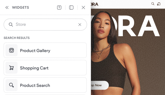
This video shows the default experience that gets added to your site when you add a Duda store to your website.

How to add a store
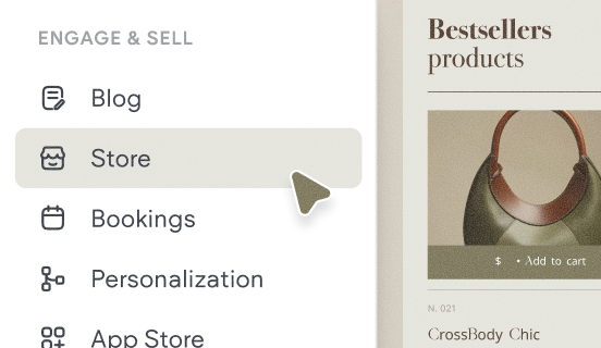
Learn how to quickly add a store to your site and get a brief overview of the key components that make up Native eCommerce.