
How to build a dynamic multilingual blog solution with tag filtering using Duda's AI Widget Builder
Discover how to build a fully dynamic, multilingual blog solution with tag filtering using Duda's AI Widget Builder. In this step-by-step tutorial, you’ll learn how to turn a well-structured prompt into a powerful custom widget powered by collections, connected data, and dynamic pages. From responsive blog galleries and category filtering to multilingual content experiences, this walkthrough will show you how to use AI to build smarter, faster, and more scalable website solutions.
Connect ChatGPT to Duda's MCP Server
Want to connect ChatGPT to Duda using MCP? This video shows you how to set up the Duda MCP Server with ChatGPT.
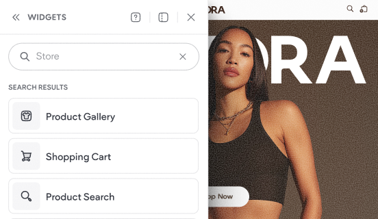
Tour the store's widgets & pages
This video shows the default experience that gets added to your site when you add a Duda store to your website.