Reordering elements within a column
Learn how to reorder elements within columns across different breakpoints in Editor 2.0
Explore how to customize the order of elements within a column. You'll see how changes made on one breakpoint, like tablet, won’t impact the layout on other breakpoints like desktop or mobile.
Through a practical example, we'll demonstrate how to move an image widget within a column on the tablet view while maintaining the original order on the desktop. This flexibility allows you to fine-tune the design and layout for specific devices, ensuring your site looks perfect on every screen.
Information
Length
Language
English
Format

Connect ChatGPT to Duda's MCP Server
Want to connect ChatGPT to Duda using MCP? This video shows you how to set up the Duda MCP Server with ChatGPT.

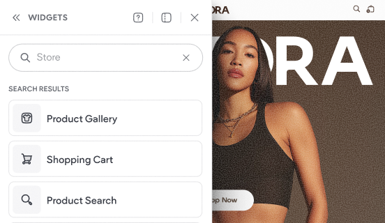
Tour the store's widgets & pages
This video shows the default experience that gets added to your site when you add a Duda store to your website.

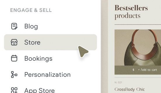
How to add a store
Learn how to quickly add a store to your site and get a brief overview of the key components that make up Native eCommerce.